Lumen UI

Built Lumen UI: shared design foundations for Astro, React, Web Components, and native interfaces, with accessible primitives, product layouts, Figma, and AI tooling.
En esta página 1 sección
Project notes
Active project
A shared language for web and native interfaces
- Estimated reading time
- About 4 minutes
- In this project story
- 7 sections
I built Lumen UI to carry a consistent visual language across products while preserving each platform’s way of building. Astro, React, and standards-based Web Components share web contracts; React Native, SwiftUI, and Jetpack Compose extend the foundations into native interfaces.
Shared tokens and explicit component contracts connect the system. Framework adapters own their rendering and interaction: progressive enhancement for Astro, components and hooks for React, custom elements for the browser, and platform-native composition for mobile and desktop apps. Applications keep their business rules, data, routing, and recovery policy.
Inside the product
Real interfaces built with Lumen: a web workspace and the SwiftUI playground. The screens use illustrative data.
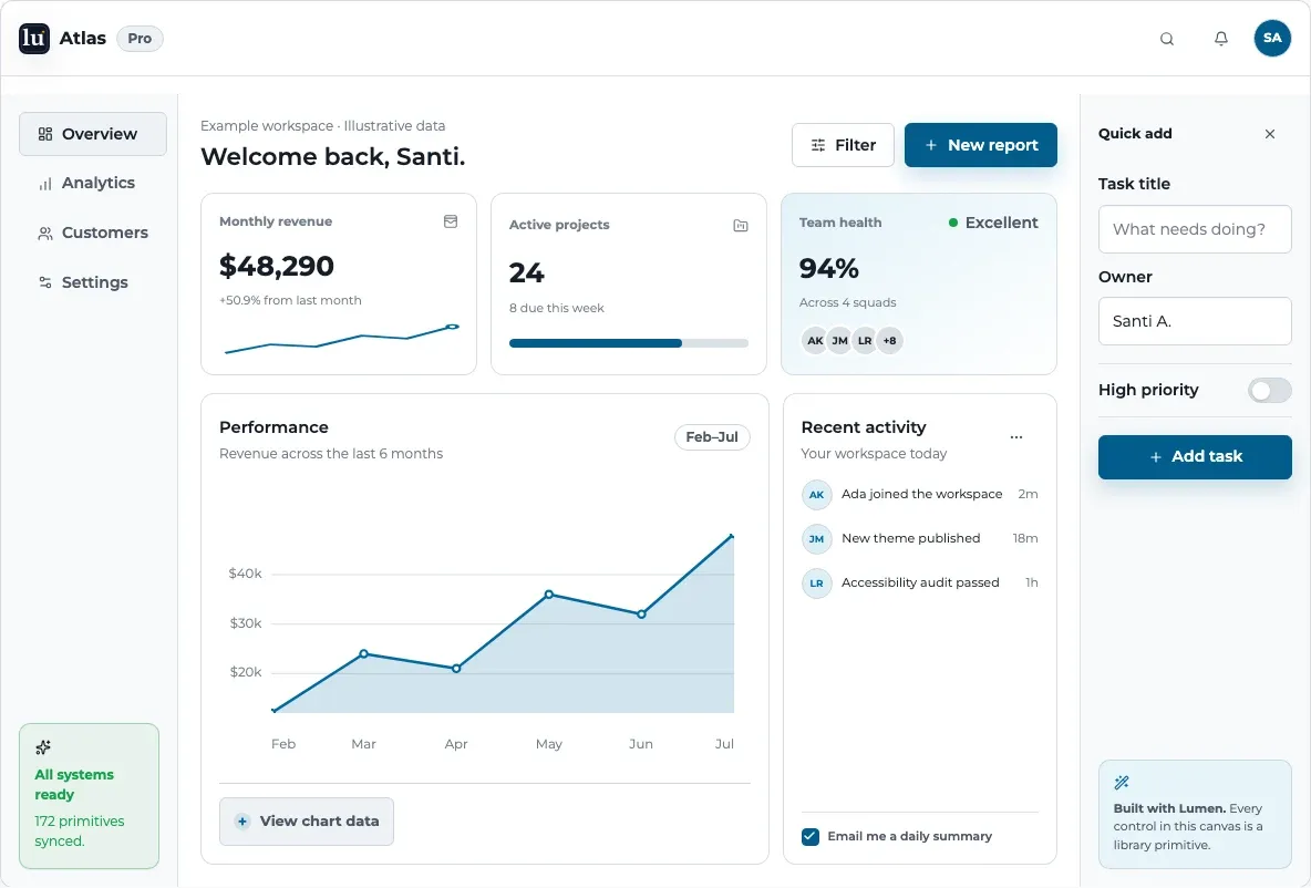
A workspace from shared parts
Navigation, charts, metrics, and form controls work together in one composition. Applications supply their own data and decisions.
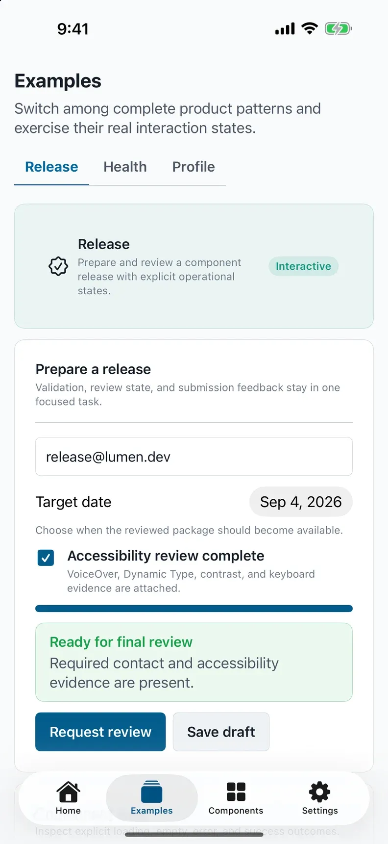
The same foundations on iPhone
The native playground expresses a release checklist through SwiftUI controls. Shared tokens connect the visual language while the platform owns the interaction.
Outcomes
Connects web and native interfaces through shared tokens and explicit component contracts
Combines accessible controls, charts, maps, and operational layouts with platform-native authoring
Supports design and AI workflows through Figma resources, an agent skill, MCP, and a machine-readable registry
Goals
Share product language across web and native interfaces without forcing a common runtime.
Make accessible interaction repeatable through semantics, keyboard paths, focus management, readable status feedback, and reduced-motion support.
Support real product work with forms, data presentation, operational layouts, and recovery states.
Make design decisions discoverable for developers, designers, and coding agents.
What Lumen 4 brings together
Accessible controls and feedback
buttons, disclosures, dialogs, fields, clipboard actions, progress, and error states with explicit interaction contracts.
Operational interfaces
data tables, calendars, Kanban layouts, navigation, and complete dashboard templates that applications compose around their own state and workflows.
Data and presentation
charts,
WorldMap,DeviceFrame, and image comparison for readable product stories, analytics, and media experiences.Motion with restraint
reveal groups, animated numbers, and layout motion with stable content and reduced-motion paths.
Native foundations
React Native, SwiftUI, and Compose adapters, alongside focused WidgetKit and Wear OS surfaces that respect their host platforms.
Design and AI resources
a Figma library, portable agent skill, MCP catalog, CLI recipes,
llms.txt, and machine-readable component and styling contracts.
Technical highlights
Web adapters
Choose the adapter for the existing application.
- Astro
@santi020k/lumen-astro - React
@santi020k/lumen-react - Web Components
@santi020k/lumen-elements
- Shared foundations
- Canonical design tokens, metadata, and behavior expectations; the umbrella
@santi020k/lumenexposes the CLI and registry. - Public styling contracts
- Semantic tokens, component props, documented variables, and stable part hooks instead of depending on private implementation classes.
- CSS architecture
- Standalone styles and explicit cascade layers for optional Tailwind use.
- Verification
- Interaction, accessibility, visual, package, and contract checks, with native compatibility and device evidence tracked separately.
Compatibility & validation
The platform families share foundations, but their component coverage and supported toolchains are qualified per adapter.
A local build, a published package, a store build, and physical-device accessibility are separate evidence.
Used in this website
This site consumes the published Lumen 4 Astro, core, and umbrella packages.
Reading layouts compose shared progress, copy actions, and navigation primitives. The website keeps its editorial styling, search, content ordering, and travel data.
This consumer work helps identify library improvements from real interfaces: clear defaults, public styling hooks, accessible clipboard feedback, and predictable motion. The v3 to v4 migration guide records the upgrade contract for other consumers.
Why it matters
Lumen makes interface decisions reusable. Applications keep their policy.
Developers
Discover a real component contract.
Designers
Work from the same foundations.
Coding agents
Retrieve source-backed guidance instead of inventing an API.
De este proyecto
Dentro del trabajo.
System design
Lumen UI: One system, three frameworks
How I built 123 accessible primitives for Astro, React, and Web Components while sharing tokens and behavior without forcing one runtime model.
Leer artículoTool ecosystem
How I Built the santi020k Developer Tool Ecosystem
How Lumen, ESLint Config Basic, Quality, Astro Doctor, Commitprompt, Dep Beacon, OG, Theme, and Auth form one practical system for my projects.
Leer artículoComparte este artículo
Compártelo.
La copia automática no está disponible.

